Jerome healy
jeromehealy@gmail.com
Tools used: After Effects, Photoshop, Rhino, Keyshot, Illustrator, XD
Promethean Screen Share
The Promethean Screen Share app is designed for teachers and students to interact with a Promethean ActivPanel from anywhere in the classroom. With this app students and teachers can wirelessly share virtually any device including: iPhone, iPad, PC, Mac, Chromebook and Android. No sign in required.
Role
Lead UX Designer
Team
PM, 2 UX Designers and development teams in the UK, China and Seattle.
Problem
Redesign current casting solution. Adoption rates were very low because the instructions for sharing screens were very confusing and specific to each device.
Journey
Defining the Problem
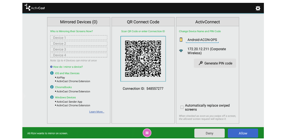
Adoption rates of the screen sharing solution were abysmal. Initially we thought the problem was the instruction page was too busy and overwhelming for teachers to navigate. Below is what a teacher would encounter. Keep in mind this was often mid-class where the teacher is expected to navigate this page, keep the class in order, and deliver a message.
Burden of Choice
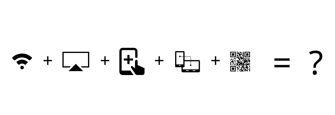
It was clear that by trying to serve everyone the old design served no one. The solutions offered for sharing screens were a QR code (that was unclear how to use or what would happen next), iOS mirroring, a Chrome extension, and a native app. The user was also required to be on the same wifi network as the panel for any devices to connect.
Less is More
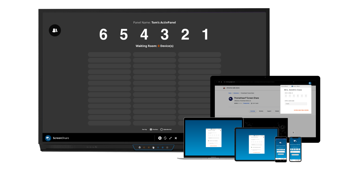
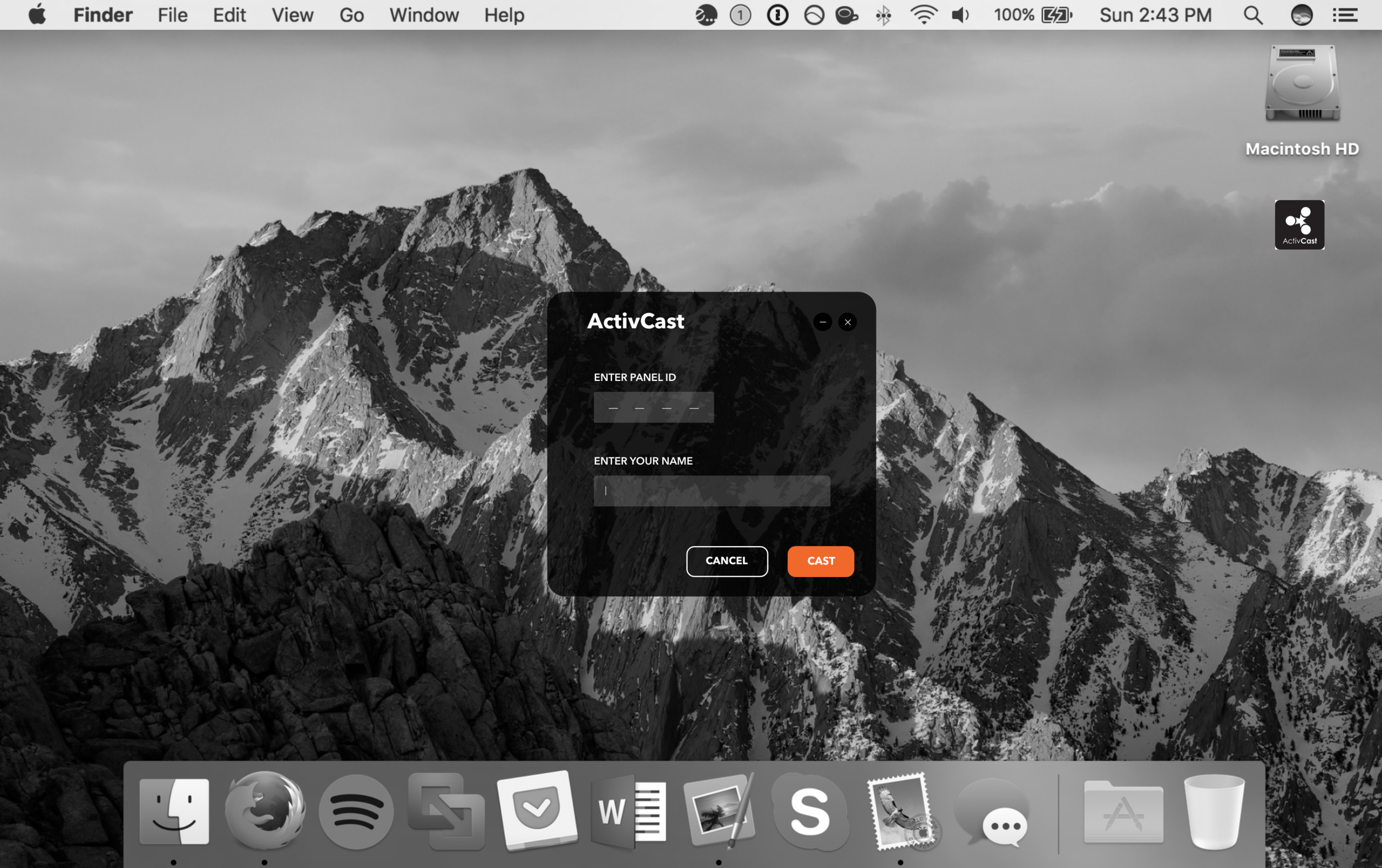
After reviewing the telemetry from other products and conducting competitive studies it was decided that a 6 digit pin would be used to connect to the panel no matter what device the user was using. So for the beginning user they would download an app, open the app, input the 6 digit pin and get connected. Below was an early prototype (with a 4 digit number) for the desktop version of Screen Share. It was also called ‘casting’ on the first revs as well.
Early Success?
On the initial redesign our usability testing was promising. People knew how to use the product and could connect much faster. The problem was adoption. Were we confident that a redesign was the solution to our users problem? Below is a usability test with a delighted user.
Speed Kills
We knew from many classroom visits that teachers always plugged into the panels and rarely shared their screens wirelessly. We initially assumed this was because the instructions were too difficult to navigate. But we saw that teachers were plugging in with competitors screen sharing solutions as well, and those solutions were much easier to navigate than our past designs. After running a simple test it was clear what the problem was. No matter how the screen sharing designed it needed to connect faster. It needed to connect faster than 26 seconds to be exact. Below is a video comparing speeds to get to a file where a physical cable is much faster.
More Value
Our engineers worked tirelessly to improve the lag time, image quality, and connection speeds from an array of devices to the panel. They also developed the app to operate on any network. This was something our competitors still can’t claim. Because of these advancements in the technology we won countless deals based on the beta demo’s alone. However, in our interviews with teachers they still were not convinced it was a better option to share their screens wirelessly. They needed more of an incentive to use the product.

Enter the Waiting Room
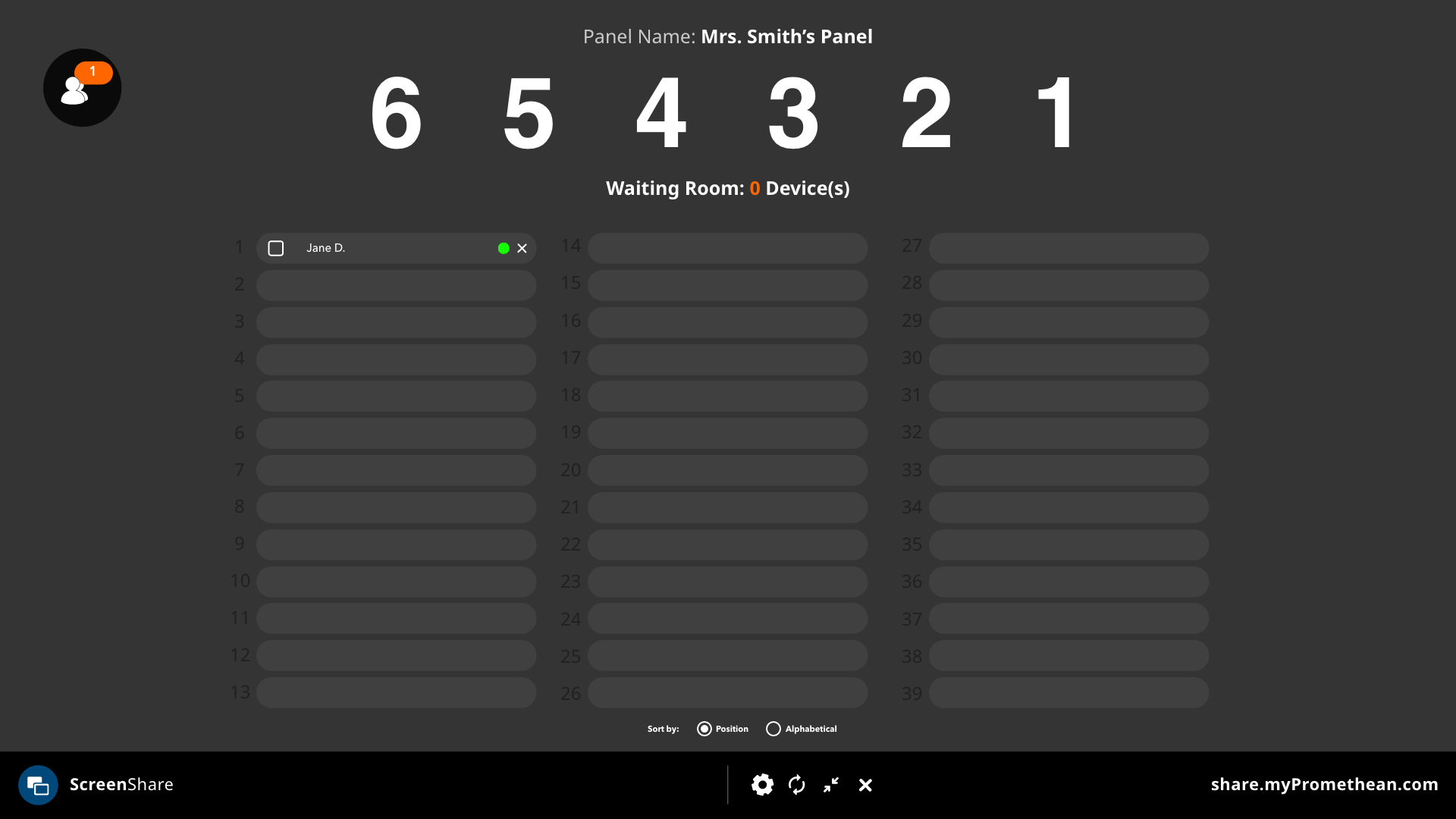
In addition to the excellent work our engineers did improving the speed and picture quality of the connection, they also made it possible to connect up to 39 devices at one time. At first we represented the connected devices with a number that summed up who was connected. After teacher interviews we realized this information was valuable to the teachers in other ways. The first being able to take role while connecting all the students to the panel. The teacher knows at a glance that if there are 30 students in the class, and 30 students are connected to the panel, then there are no missing students that day.
“You Are Not The User”
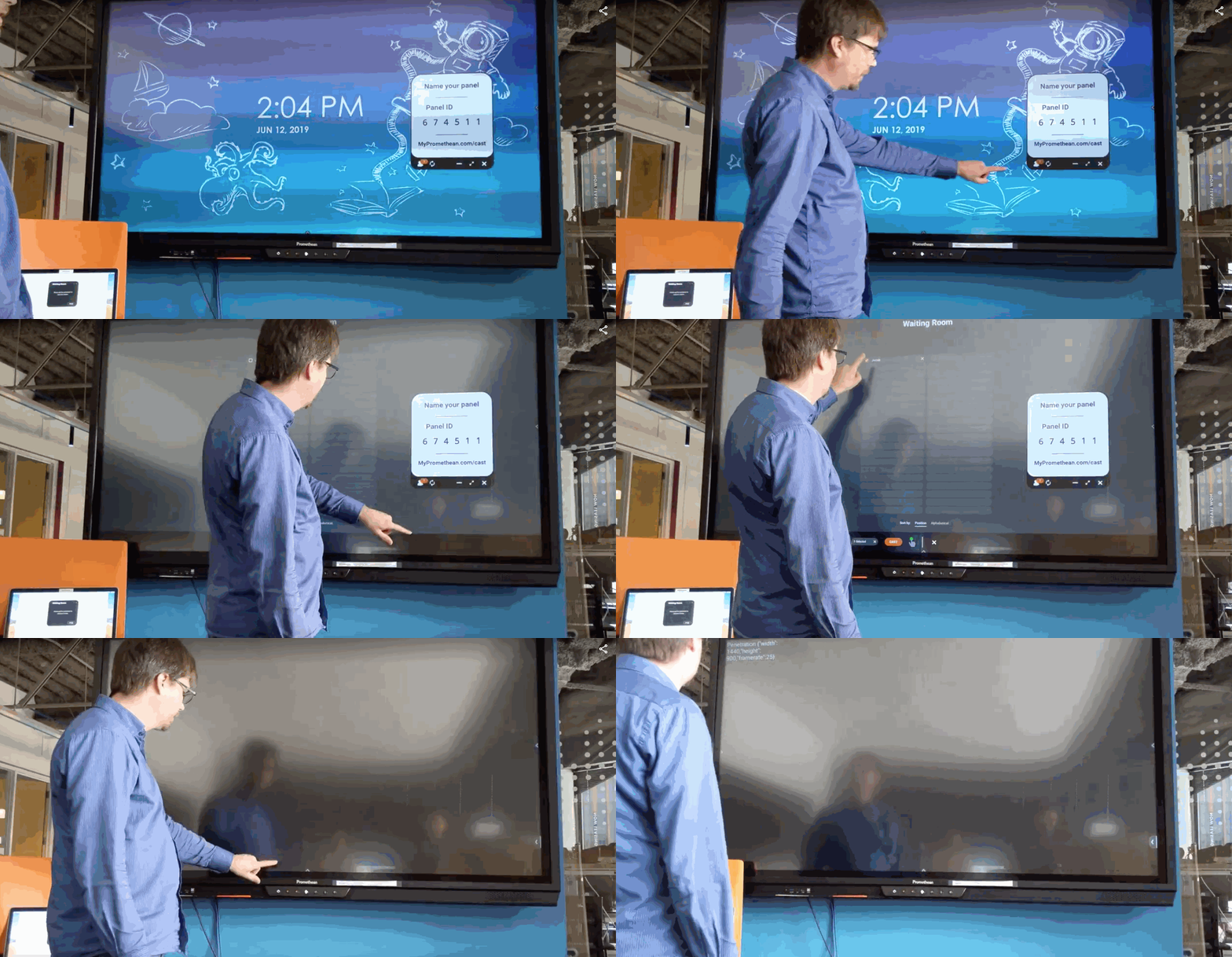
At Promethean there are panels in every conference room, and when we created the first beta’s for Screen Share we installed them all around the office to get as much early feedback as possible. The number one request in the office was the ability to share their screen without needing to physically go to the panel and tap their name. Admittedly a great feature for a corporate setting, but pretty disastrous for a classroom setting. The teachers we talked to were VERY concerned about being able to directly share screens and wanted to see safeguards against it. Teachers see their panels as emotional regularity tools and could easily lose an entire class with an unexpected screen being shared on the panel. Below is an early concept we tested to make sure screens had to be shared from the panel.
Protecting the Student
Another top priority of the Screen Sharing solution was making sure students knew when and what they were sharing. After doing market research it was clear that other sharing solutions didn’t make it 100% clear when the user was and was not sharing. In some instances a user could share, shut their laptop, leave the room and open it again and still be sharing. To combat this we relied heavily on animations, borders, and bright colors to indicate when the user was sharing. We also worked with engineering to make sure that when the user shut the device or put the device to sleep that it would sever the connection. Below is an early concept of how we wanted the experience to be for the sender device.
The Same, But Different
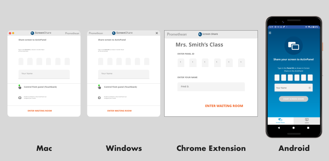
As stated above this app supports iOS, Android, Mac, PC, Chromebooks etc. There was a design challenge to make all the UI uniform while still maintaining the design language of each OS. We didn’t want users thinking a Mac UI was on their PC and visa-versa. At the same time we didn’t want the UI’s to look so different that if they visited the support page they would need to see Android instructions because the Mac instructions didn’t make sense. Below are examples of the subtle changes in the UI while still maintaining the common workflows.